Emails that spark a conversation
EMAIL DESIGN • RESPONSIVE DESIGN • LIGHT MOTION GRAPHICS
Doubling email open rates within 12 months by introducing mobile-first, consistent designs.
Company
National Trust of Australia (Queensland)
Contributions
Email design, light motion graphic design, copywriting, audience list segmentation, automated workflows
problems & goals
Delivering personalised, engaging emails that matter to you.
I was asked to find ways to improve the company’s marketing emails and performance. First, I had to understand what isn’t working and why. After analysing the user journey from sign up to receiving emails, and reviewing existing email types and designs, it became evident that there was limited consistency, low personalisation, low accessibility, limited responsiveness and no clear structure.
Goal 01
Increase open rates
Goal 02
Increase click-through rates
Goal 03
Lower unsubscribe rates
proposed solutions & exploration
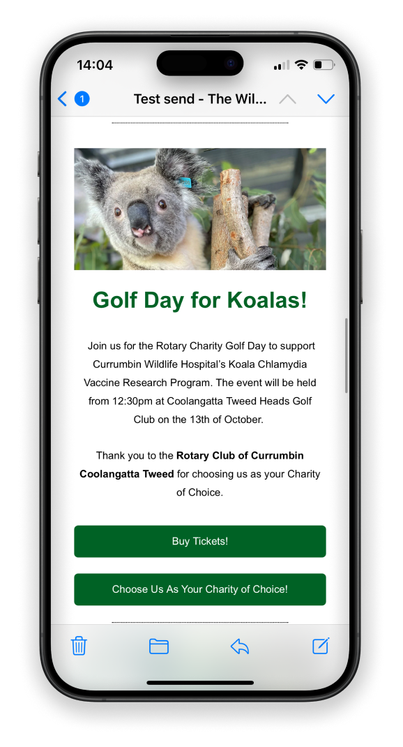
Idea 1: Advanced segmentation
Existing audience lists were compromised of four large subscriber groups, however, we have more content to share than just four topics. Dividing the audiences into smaller, more focused groups and allowing them to choose what they want to hear about means they receive relevant content to them – and only that content. This can lead to higher engagement, reduces unsubscribes and increased revenue from emails, as recent studies show.


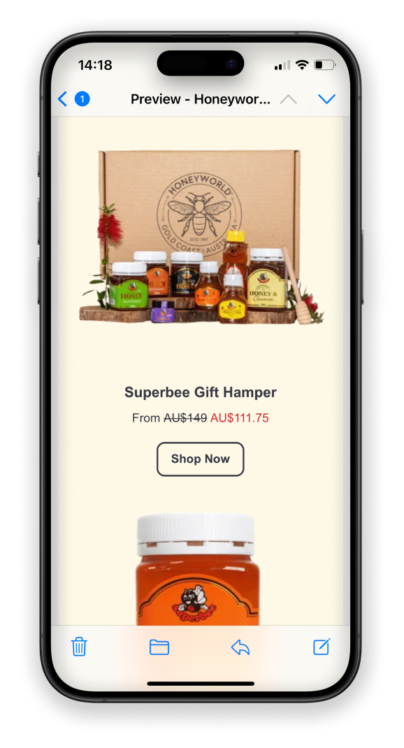
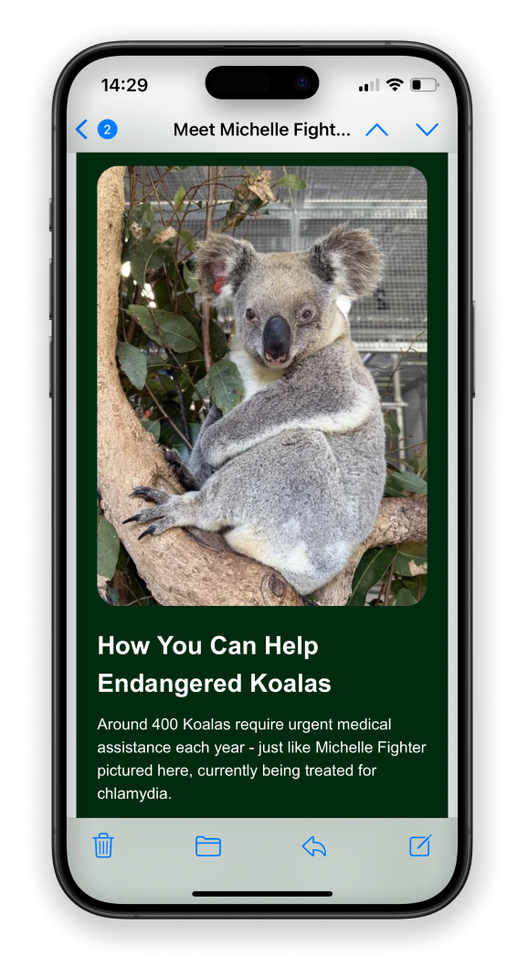
Idea 2: Personalised content
Studies show that personalised emails significantly increase open rates, click-through rates and engagement. In fact, 59% of customers prefer personalised content and relevant messaging. Advanced segmentation will allow to send tailored content to readers that really matters to them. In addition, I propose to start using personalisation tokens, personalised subject lines and more active voice.
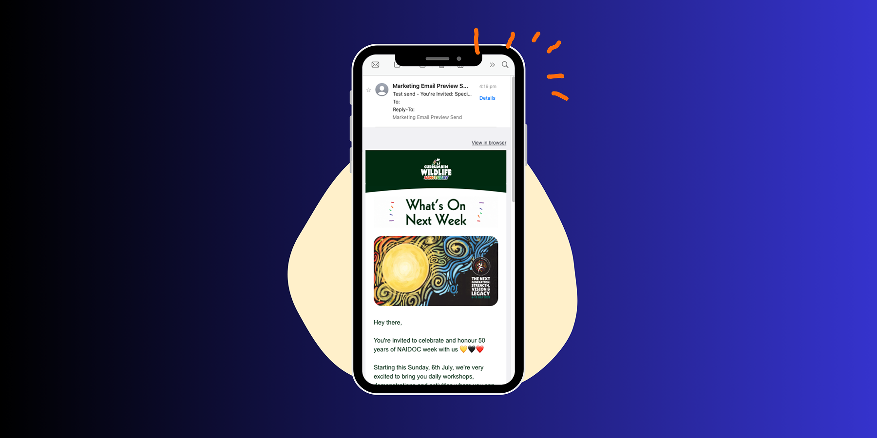
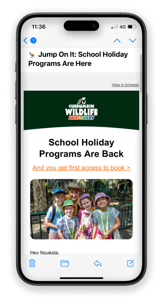
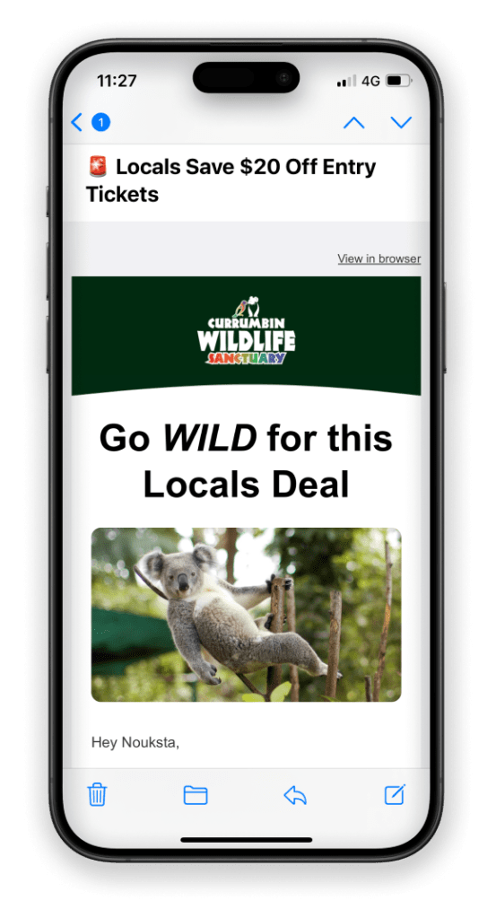
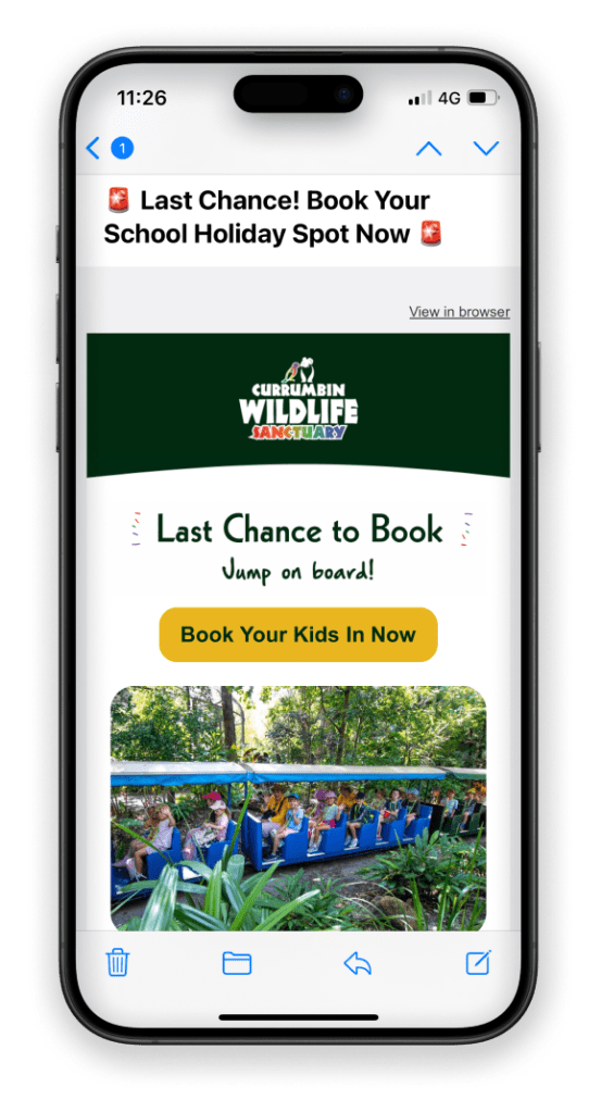
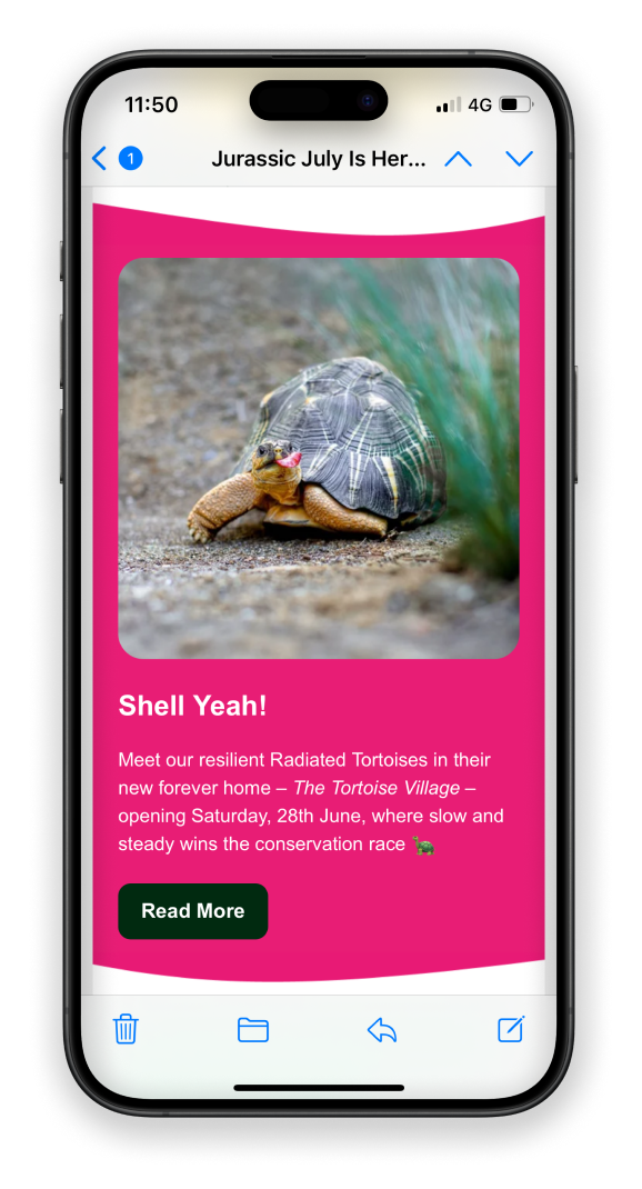
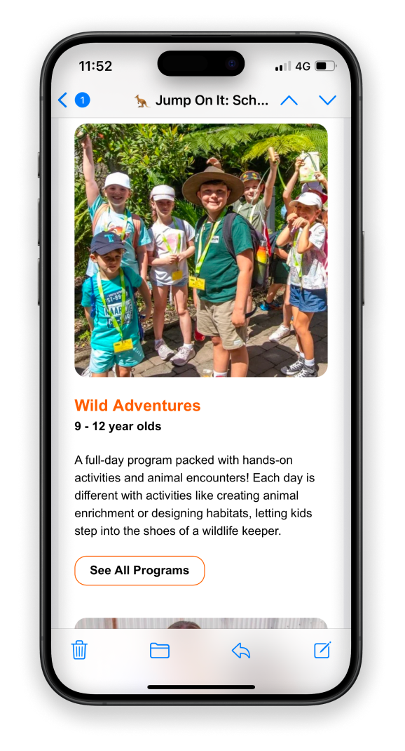
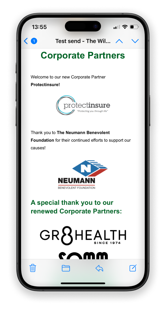
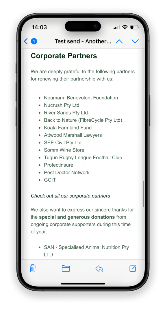
Idea 3: Polished & accessible design
Studies suggest that guiding the reader’s eyes with a clear, logical flow is key in helping them find information fast and engage with content. It can increase click-through rates by as high as 40%. Creating email templates for each subscription and introducing a clear hierarchy will provide readers with a consistent, familiar experience. Plus, email designs should be accessible with good colour contrast, image alt texts and readable fonts to ensure everyone can read and interact with them.

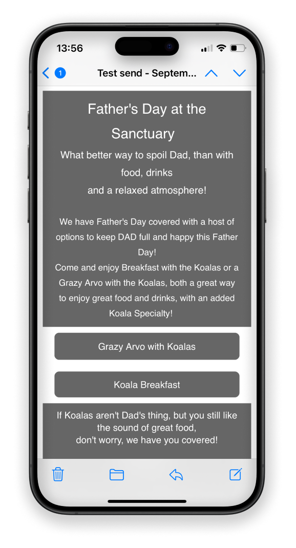
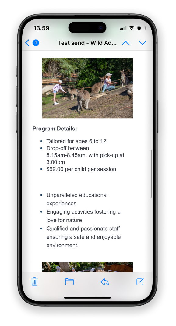
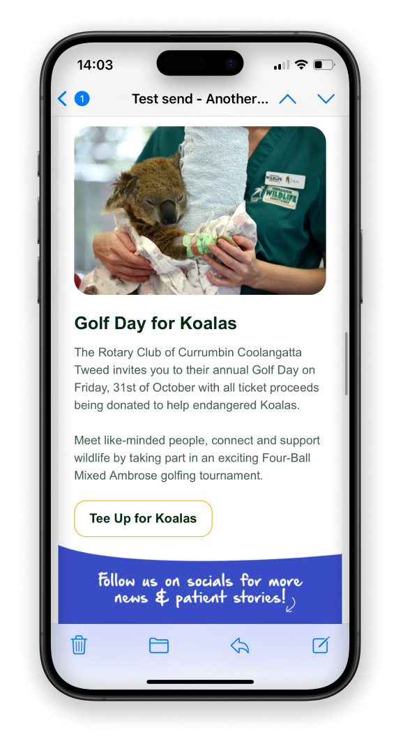
Idea 4: Mobile-first layout
The statistics show that around 80% of our subscribers open their emails on their phone. So, creating a mobile-optimised design is crucial to ensure an enjoyable experience for readers. Of course, it still needs to look good on larger devices, but it’s always easier to upscale than the other way around. A mobile-first design would mean large buttons that are easy to click on, good spacing and break up large text blocks. And for ultra important messages, place them at the very top before scroll to get the message across.
the results
Clean. Clear. Consistent.
Introducing responsive, accessible and on-brand email designs that have doubled open rates and lifted click-through rates by +1.6% within 12 months.


Let’s collaborate
Like what you see or have feedback? Get in touch!
Your message has been sent

