Delivering footy news in a more engaging, intuitive way
UI/UX • APP DESIGN • PRODUCT DEVELOPMENT
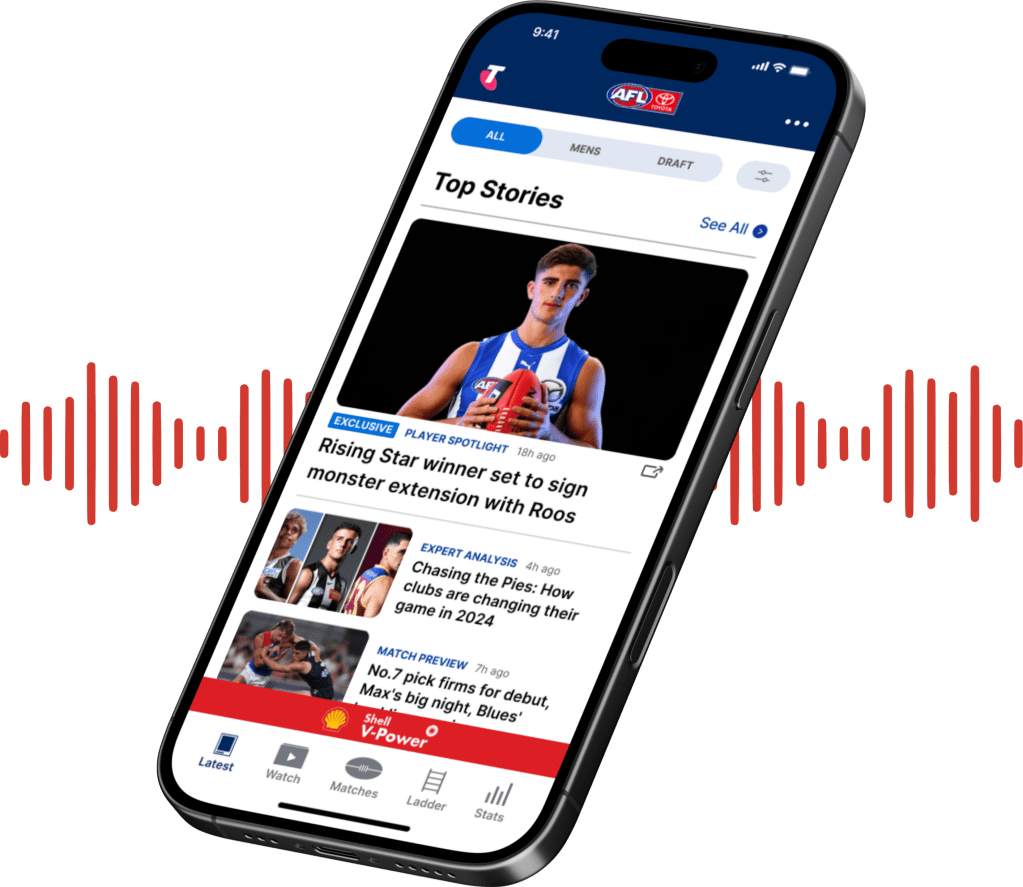
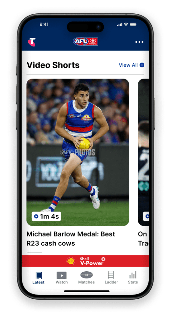
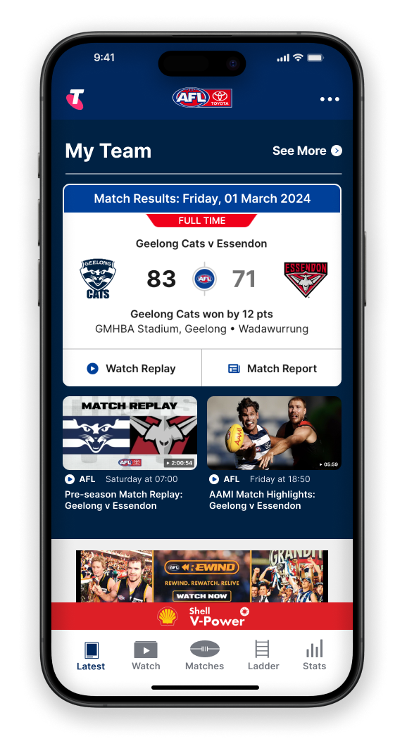
I re-designed the AFL app’s UI, created a new feature and introduced a new type of content to offer fans a more personalised, seamless and engaging way to get their latest footy news.
client
Australian Football League (AFL)
industry
sport & entertainment
contributions
UX research, UI/UX design, new feature development
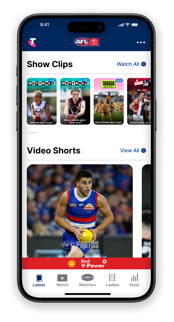
problems & goals
Creating a calmer, more personalised experience.
Without access to company data, I had to think of a different way to get my hands on user data. The reviews section in both Apple and Google app stores proved to be a great place for this. My research showed that users are unable to get a lot of personalised, easy to digest content and find the interface cluttered. This leads to users feeling frustrated and overwhelmed, which is known to lower interaction and engagement.
01
Offer a more personalised, seamless experience
02
Increase user engagement and retention
03
Improve user-friendliness
user story
As a passionate footy fan, I want an easy and quick way to catch up on the latest footy news, so that I can stay up to date with what’s important to me.
– Matt
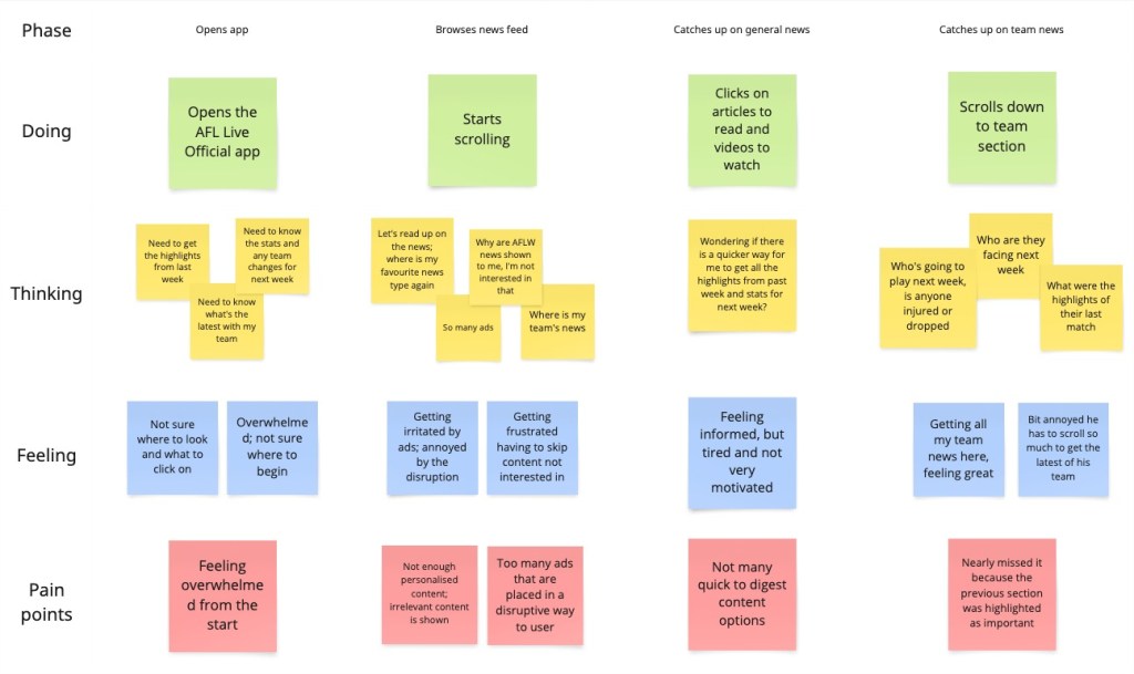
user scenario mapping
proposed solutions
Idea 1: Add new feature; A content filter bar
PRO: Easy to use and allows for a highly personalised experience, which is shown to increase satisfaction and spending
CON: User may miss content relevant to them if content categories are not set up properly
Idea 2: Offer short-form video content
PRO: Easy to use digest content. Studies show that short-form videos can increase engagement by up to 2.5 times
CON: Requires resources for ongoing content creation
Idea 3: Reduce ad clutter
PRO: More careful ad placement to improve overall experience. Research highlights that ad clutter is a primary obstacle for positive user experience
CON: Depends on the company’s agreements with partners
Idea 4: Simplify UI layout & clearer visual hierarchy
PRO: Highlights important elements and makes content more easy to understand. This offers an improved experience with studies showing an average of 70% of users preferring simplistic and minimalistic interfaces
CON: Needs to be done step by step as users don’t like too many changes at once
final design
Let’s take a closer look
View the before and afters of the current AFL app and my proposed re-design.
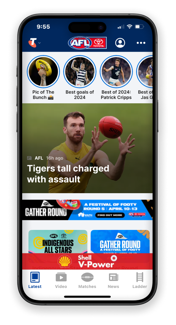
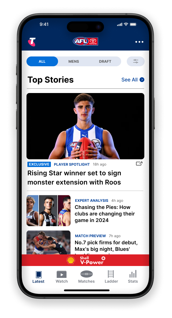
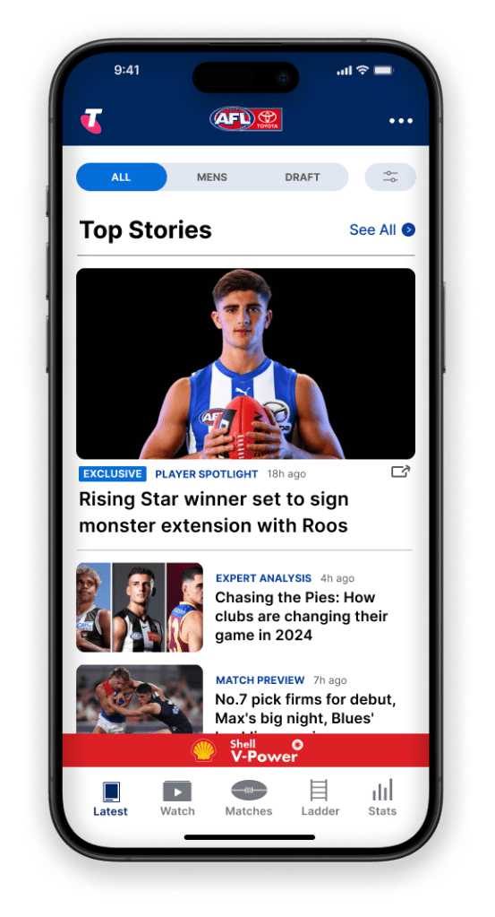
→ new content filter bar lets users filter content based on their needs and save their preferences
→ new share icon for articles allows for more interaction between fans, increasing user engagement
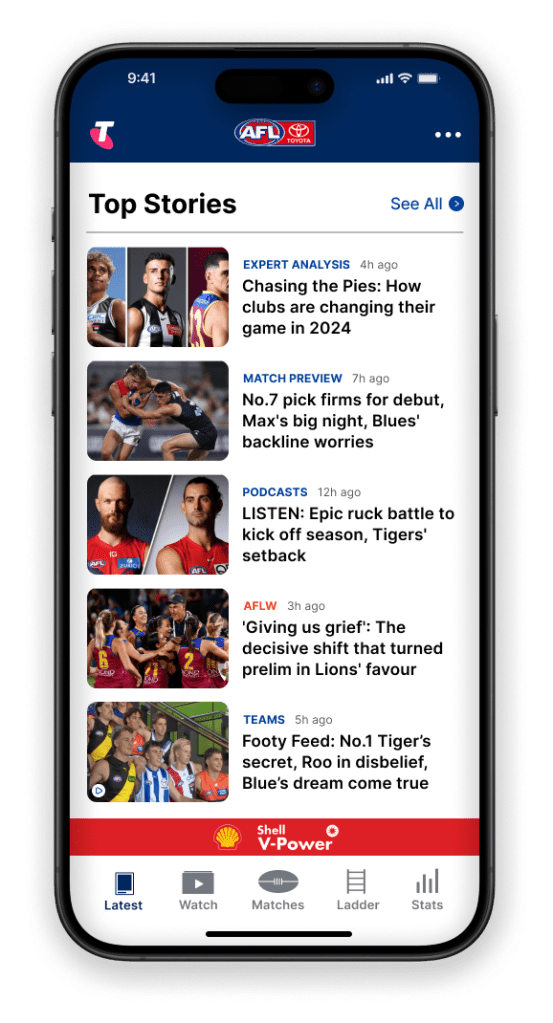
→ more white space and scale, and more careful ad placement, creates calm and intuitive user experience
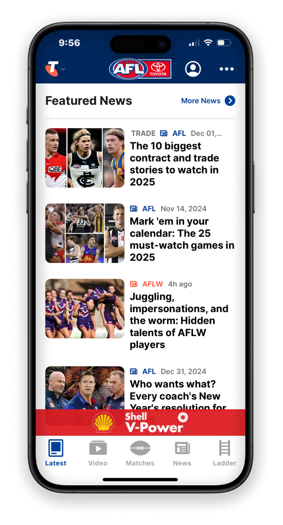
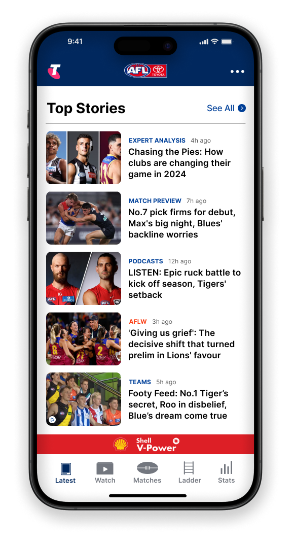
→ rule of thirds creates and improved text size variations creates balance, avoiding overwhelming users
→ short text instead of icons as sub-headers allows for clear understanding of content
→ short text improves accessibility and understanding for users with visual impairment
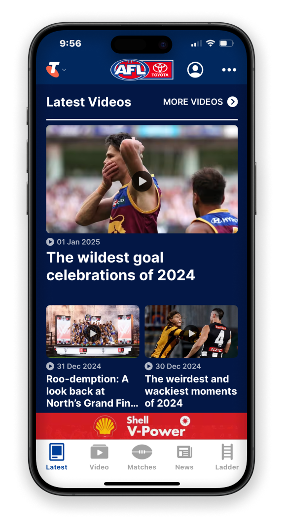
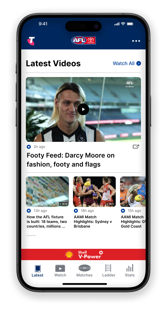
→ consistent button design to avoid slowing down user decision-making
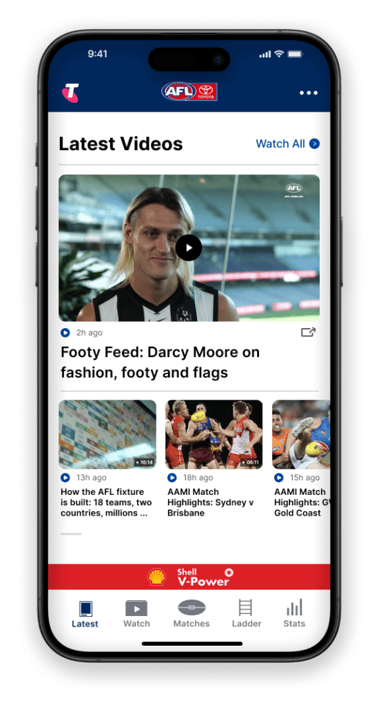
→ horizontal scrolling to display more videos without cluttering this section
→ consistent background colour in this section to avoid taking away attention from more important content on this page (My Team)
alternative solutions
I also thought of other ways to solve the identified user pain points, such as adding a pop-up where you can set & save your content preferences or creating an algorithm that displays content based on user behaviour. For example, views of specific content. These could still be implemented in the future, but my main goal was to come up with easy to implement solutions with maximum immediate impact.
from ideation to testing; from prototype to final design
After understanding the problem space and settling on low-effort, high-impact solutions, I drafted my first wireframe. I identified a few potential barriers, so I did an iteration to save time when it came to prototyping.
The first iteration gave me a good foundation to start prototyping, where I did two iterations after testing each version with a small group of people. This allowed me to optimise my solutions, delivering a final design that enhances the user experience and increases the AFL app’s engagement, retention and loyalty for the business. Of course, the new design would have to be tested and validated.
final thoughts
There are so many learnings I take from this case study. From teaching myself how to use a new design tool to creating my first wireframes and prototype. Some key learnings:
- taught myself a new design tool, Figma
- found a way to gather secondary user data without access to company data
- widened my research skill set through conducting observation; a research technique to obtain primary data
- learnt the importance of testing your design
- still need to learn how to best use auto-layout for responsive designs
- iteration is the road to perfection; every iteration allows you to optimise your solutions and deliver a final design that ticks all the boxes
Let’s collaborate
Like what you see or have feedback? Get in touch!